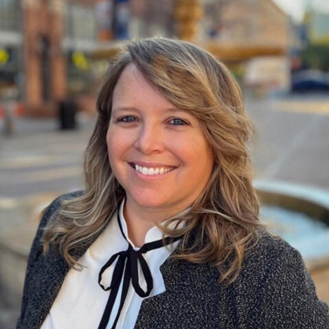
Hi! I'm Sarah Dzida.

I help business leaders and brands jump into emerging markets and leverage technology in ways that entice customers and excite teams everyday.


Here's how I can help:

  • Move fast and fix things: Unparalyze your team. Break siloes. Align everyone.

  • Clear roadmaps: Successfully push big ideas from concept to launch.

  • Operations optimizations and design-thinking training: Work smarter rather than just faster!

  • Break the template: Don't just benchmark the competition.

  • Products for humans: Always build experiences that matter to people!


"Sarah is thorough and delivers impact quickly."Christy Willingham, Head of DTS Powered Marketing

Results


"We've worked on [lots] of projects, and Sarah consistently delivers work of the highest quality."—Jaime Levy | Author of UX Strategy and Industry Leader

"Sarah knows her craft, is confident in her work, and open to collaboration."—Carrie Ko | Executive Strategy Director, Ueno


Services

Sarah leads SMEs through a post-it ideation workshop on dementia, caregiving and health.

How to Work with Me

I have a strong track record of leading people and organizations to successful product launches that help teams jump into emerging markets, leverage new tech and transform their processes.I ensure your outcomes drive sustainable long-term grown.

4-Week Roadmap

I'll build a short- and long-term roadmap for you in 4 weeks with actionable steps for your team to follow for innovation.

AI Audit

Digital and technological maturity is now a must! Let's identify AI opportunities for your product, team and organization!

Product Innovation, Execution & Launch

You want to build something new or better! But how? Let's make a roadmap and execute a successful launch.

Fractional Leadership

Get executive and senior-domain level expertise for product strategy, experience design and content strategy.

I also mentor and train teams while on projects or through workshops on specific tactics.


"I very much appreciated Sarah's ability to lead the team through the forest."—Ran Craycraft | Managing Partner, Wildebeest

"Sarah was able to get the team moving toward a singular goal."—Nick Jartcky | Senior Digital Marketing Manager, Xperi


About Me

Sarah leads SMEs through a post-it ideation workshop on dementia, caregiving and health.

Hello! I'm a 5x award-winning product maker and strategist with a deep interest in creating human experiences through technology, storytelling and holistic strategy.I began my product & design career working on pre-seed and Series A ecommerce and SaaS apps. Then I had a long stretch of life working with award-winning agencies of all sizes—Five & Done, Gensler, Deloitte, Kluge Interactive, Technology Humans & Taste, etc—on for clients like Lexus, Walmart, Deloitte, City of Los Angeles, and even the Catholic Church.In 2015, I launched my independent consulting business. Since then it's evolved as I've deepened my skillsets. Currently, I work directly with teams—embedding as a fractional executive to push through digital initiatives and refine customer journeys.I am passionate about teaching and mentorship. I've taught bootcamps at General Assembly. I co-organized the social-impact design-thinking meetup OpenIDEO Los Angeles for three years and grew the membership to 300+. I'm currently teaching at USC!


"Sarah is a perfect collaborator. Creative on her feet and able to get the job done."—Alex Molloy | OpenIDEO Los Angeles Chapter Founder


Contact

Let me help you be greater at what you do.Feel free to schedule a consult or email me: [email protected]

The About page on the CoreLogic main website.

"Our clients enjoy working with Sarah because she digs into the issues."—Diran Yanikian | Founder of Dirango

DTS / Xperi

DTS powers 2B+ devices globally. As a B2B2C software solutions enterprise, they partner with OEMs to put their audio/sensing codices into cars, homes and movie theaters.

The Problem

Recently acquired by Xperi Corporation for $850 M, the company wanted to:

  • Convey product and brand value to their B2B2C audience across all channels.

  • Continue expansion into emerging markets like automobiles.

  • Build a more effective web experience.


My Results

Over 12 months, I guided the teams through 5 strategic goals, revaluating each per quarter. Here are some process highlights and their results.

Rebuilt the customer experience funnel!

B2C funnel flow suspect level

In building out and refining the funnel, a lot of stalled initiatives finally got reactivated. Here are a few:

  • Teams revamped campaigns around new funnel flows, including the stalled 30th Anniversary campaign. It ran for 5 weeks across all channels.

  • A dormant newsletter list of 50,000 B2C subscribers now had multiple use cases to become a pivotal source of user data.

  • The digital team built out a CRM, connecting Salesforce tools like Datorama and Pardot with Sprinklr with defined KPIs to track across the year.

Redesigned the website

Batch #1 overview of wireframes in Figma

Result: With a new funnel, we made meaningful website changes to drive, engage and track B2B and B2C traffic through the new CX. For example:

  • Defunct functionality finally got removed—pop-up email clients, empty dropbox folders

  • Old products got sunset or absorbed into the new brand taxonomy.

  • The story of DTS as a modern tech company finally was online—one that differentiated it from other Xperi brands.

  • Lead generation forms got launched!

Two audiences means two experiences.

Redesigned homepage of DTS.com

Result: Through collaborative meetings with leadership, we guided the teams to develop guidelines for their distinct markets, which they began to independently integrate into their work. Leadership decided to take the efforts into other Xperi brands.


Testimonials

"Sarah became the source of best practices for us."—Nick Jartcky | Senior Digital Marketing Manager, Xperi

"Sarah is thorough in getting to know the business so she can deliver impact quickly."—Christy Willingham | Head of DTS Powered Marketing

Conclusions

While I helped the team achieve a lot of tangible implementation, I was personally most satisfied in helping them realign around a shared language, vision and understanding of the brand, users, customers and goals.


CoreLogic

The $1 B+ Fortune 1000 company funnels customized data services across the real estate, mortgage, insurance industries as well as governments sectors.Basically anyone who decides anything about property ownership, land valuation, and risk assessment uses CoreLogic.

The Problem

After multiple mergers and steady changes in leadership, the CoreLogic marketing team under a new CMO had finally aligned on a brand vision and strategy. They just didn't know how to activate it across their website, customer experience or B2B product teams. And they wanted to do it in a 4-month timeline.


My Results

The Sr Creative Director pitched my leadership to the CMO as the person who could get it all done. And we were off to the races!Here are some process highlights and results:

4-sprints, 3 months, full-website overhaul.

CoreLogic Sitemap

Result: We had a leaner, cleaner, more user-friendly and beautiful site! Over 68,000 inactive pages got removed. I helped roll out CoreLogic's new brand strategy and product taxonomy. Most importantly, we hit the launch deadline, and helped CoreLogic secure $6 B in private investment.

Cross-functional team management achieved!

Sample of wireframes in Figma

Result: Throughout the 10 months, I was constantly pulled into meetings with third-party vendors and other CoreLogic teams to ensure chatbots, lead generation, SEO, metadata, career pages and brand guides cohered with the fast-moving web strategy. Here's what happened:

  • Chatbot integration didn't get rushed.

  • When the dev team had to drop out due to India's Covid surge, I was able to replace them with a trusted partner.

  • All three marketing teams had their work flows transitioned into the new CX, and all pages were properly vetted for launch in time.

  • I also worked with the Sr Creative Director to lay the foundation for an future SSO portal for all SaaS products.

Laying the foundation for future initiatives

New CoreLogic product taxonomy

Result: In the months following launch, I continued to work with leaders to redefine the product taxonomy so it was independent of the brand. When a new CMO came in, I was able to onboard her, and she and I worked on building out a campaign product marketing flow and automations to prevent the teams from returning to silos.Since my tenure, the overall architecture, taxonomy and strategy remains strong!


Testimonials

"I loved the way Sarah wrangled all our teams into a cohesive strategy."—Josh VandeBrake | Sr Web Strategist, CoreLogic

"I valued Sarah's leadership and ability to move the team forward with a smile."—Tico Clark | Software Engineer, CoreLogic

Conclusions

Definitely one of the wildest timelines ever! But it cemented how much I enjoy working and mentoring teams on great process, great design and great experiences.


Kid HQ - Walmart

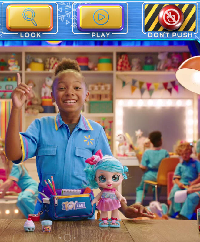
In 2018, Walmart, the interactive video platform Eko, and the agency Technology Humans and Taste created ToyLab—a interactive toy catalog for kids. Forbes called it, "The best thing Walmart's done all year." It won a lot of awards.In 2019, they decided to see if they could top that, and they asked me to manage the creation and launch of three of them.

The Problem

The teams decided to build a virtual "KidHQ" in which companies like Walmart and Mattel could "rent" floors. Through a "funovator," kids could access three gaming experiences: Toy Lab, Barbie Dream Floor and Meet Santa. There was also a Parents' Only floor where adults could access Christmas wishlists from their kids; mainly, they could see what toys their children loved most!Ultimately, each was product and system unto itself that had to be built from scratch and synced together. We kicked off in the summer with the deadline for launch by Nov 1. for the holidays.


My Results

  • Over 3.1 million engaged view with kids spending an average of 10+ minutes playing in Toy Lab

  • Over 2.1 million toys were added to Toy Reports and 90% of Toy Reports were shared with parents.

  • 179 M impressions

  • 8 M total interactions

  • Best Interactive Content Series or Piece - Digiday

  • Silver Telly Branded Content Craft-Interactive Video - Telly Awards

  • Silver Telly, Branded Content General - Children - Telly Awards

See process highlights below.

Watch out for legal requirements!

Process: When building entertainment for children, COPPA (Children's Online Privacy Rule) matters. Ultimately, lawyers wouldn't validate we were safe until after the majority of design work was done. So I needed to be the SME fast.I captured COPPA requirements in documentation like user flows. This helped the design and dev team know what moments needed them.

New CoreLogic product taxonomy

Result: We not only set the method that all other shows in KidHQ followed to comply with COPPA. But I ended up leading legal walkthroughs myself to onboard attorneys.We also safely navigated the age gate—cutting the ecommerce Grown Ups Only Floor off from the entertaining kid floors.

Maximizing User Research in 1 Day

Process: Fortunately, we had a lot of learnings from the previous ToyLab, but GrownUps Only was new. Would parents even want to access a wishlist? Would they use it to buy Christmas presents for their kids?Every year, Walmart hosts a "Toy Day" at their HQ in Arkansas in which they invite thousands of families to play; this is how Walmart tests new toys. When I found out I was being sent, I immediately worked with the innovation team to come up with some experiments to validate our assumptions.

The Zera Hemp Lab Accounts Portal

Results: Ultimately, we scraped several methods for the fastest, quickest and easiest way to remove any ambiguity around the GrownUps Only floor. I conducted onsite guerrilla research by approaching parents and asking 1 question: "If you weren't here at Toy Day, how would you know what your kids want?"The results validated the whole concept of the wishlist and helped us design out the functionality across the Barbie and ToyLab floors.

How to Design for Products AND Film

Process: Dev, design, creative, marketing, production, directors, and film crew—from offices in NYC to a stage in Long Beach—they needed a single blueprint to stay aligned. My documentation was the world map for each team, and I updated it daily throughout the two month production process.

The Zera Hemp Lab Accounts Portal

Results: We got it all done by Nov. 1. And the goal for engaged views was met by Dec 4th more than 3 weeks before Christmas. The most popular toy had an average play time of 5 minutes.


Testimonials

"Sarah turns problem-solving into play, finding ways to simplify the most complex things."—Julia Gorbach | Director of Originals, Technology Humans & Taste

"I will 100% recommend Sarah because I know she gets the job done."—Mila Thomsen | Associate Creative Director, Technology Humans & Taste

KidHQ, ToyLab & Grown-Ups Only Floor Press:


Whaddyawannaknow?

In 2018, Walmart invested in a $250 million strategic partnership with Eko to attract shoppers and boost customer engagement through interactive video experiences.

The Problem

With its proprietary platform, Eko then reached out to the XR agency Technology Humans & Taste (THAT) to develop several shows. THAT pitched three winning ideas, and then they brought on dedicated teams to build out each one.I came on for a show that was like the Internet and about “everything” called “Whaddyawannaknow.” Over 8 months, I became the all-round guru of the full-experience.


My Results

  • By the numbers, users consistently played up to 20 facts, which equaled about 5-10 minutes of play time.

  • We won the 2020 CommArts Award for Interactive Mobile/Tablet Entertainment

  • THAT invited me to lead the next version of their award-winning ToyLab as well as KidHQ.

  • THAT invited me to build out their AI MVP called DumDum.

How do you validate a creative concept?

Process: The teams were advertising and creative experts. They didn't know about product-market fit or the design process. So that was the first thing I did—build out prototypes to test with users on the street and busy moms virtually.

New CoreLogic product taxonomy

Result: Our testing results validated the overall concept. But more importantly, it encouraged THAT and Eko to test the other shows, too.It also made testing much easier to sell as we moved along. We even ran several focus groups to assess and optimize key features.

Paper prototype unlocks the key experience!

Process: The creative minds wanted our show to be like an internet rabbit hole. So I spent a lot of time assessing the Eko platform and studying the benchmarks of interactive video. At the same time, I ran my team through ideation and design-thinking exercises while the writer collected facts.

New CoreLogic product taxonomy

Result: I eventually made a paper prototype, and that solidified the concept for all parties. We could now understand the shape, scope and level of effort across the project. This helped production plan filmmaking, and it also helped us plan for custom functionality through a third-party dev.

Emerging technology means YOU make the methodology.

Process: It was so great to work with a group that understood the "rules" weren't set yet for interactive video. So I had to build the infrastructure myself—creating a documentation structure that was useful to writers, designers, devs, marketers, and filmmakers for a new platform like Eko.

New CoreLogic product taxonomy

Result: My work documented all the unique use cases of the show—coming out to over 30 ft of choicepoints and gaming arcs. But it also set the standard for how THAT and Eko decided to systematize making new shows. They invited me to continue working on upcoming projects. And they asked me to teach incoming designers on how to write the documentation.


"Someone clearly understands that a llittle fun goes a long way."—Libby Bawcombe | CommArts Juror

"This is one of my favorite pieces this year. It feels like a video version of Wikipedia."—Phillip Tiongson | CommArts Juror


Gensler & Travis County Civil & Family Courthouse

Travis County is the fifth most populous county in Texas. It tasked Hunt Development Group who partnered with architecture and design firm Gensler to bring a new Civil and Family Court Facility to life.

The Problem

There were lots of digital aspects to consider in addition to the building itself. Then Covid happened—disrupting the timeline.After three years, the teams were less than 6 months away from bringing people into the building. So it was time to address all the digital experiences—websites, kiosks, display monitors, a docket system, jury experience—that had to exist.


My Results

In 2022, the $333 M building welcomed county constituents!But most importantly, Travis County lawyers, defendants, and other constituents didn't have to access PDFs to see court schedules, changes and other information anymore! All data was now synced and in real-time.See below for some process highlights.

Mapping out the full jury experience

Process: I audited the full front- and back-stage jury flow across all government teams. In about 72 hours, I knew more about the jury process than even the Travis County stakeholders.

Service blueprint of the jury experience

Result: I uncovered a big blind spot! There was no location in the new building for jurors to congregate! Gensler moved quickly to get alignment and find a solution.In addition, I identified several use cases for new tech, such as:

  • How to get jurors to opt into SMS notifications

  • What out-of-scope webpages needed updates

  • How judges sync online dockets for jury trials

  • How to us kiosk QR codes to wayfind for jurors

Digitizing the entire docket and syncing it in real-time.

Process: The original dockets were PDFs, posted once a week on the government website. But lawyers, defendants, and families would only know about changes if they were in the courthouse, talking to one of the clerks.Therefore digitizing the docket was always the plan. But how? To help the County IT figure it out, I diagrammed out how to sync the databases and worked with Gensler and County teams to solidify the system.

A picture of the kiosks located throughout the Travis County Courthouse building.

Results: The brand-new online docket experience for the county exists! It syncs in real-time across the Travis County website and courthouse displays. View here. Constituents don't need to be in the courthouse to receive timely updates anymore.

Making a cohesive web experience on TravisCountyTX.gov

Process: Government sites are complex and cumbersome. I wanted the experience to be as smooth as possible for constituents navigating from Gensler-designed pages to others. Also, I knew our designs would set the precendence for any future updates by the County team.I made designs in Figma, and a sitemap connected all experiences and platforms together.

A picture of the kiosks located throughout the Travis County Courthouse building.

Integrating New Pages on TravisCountyTX.gov The new courthouse webpages got updated, as well as informational pages about jury duty and where to find dockets. View here. And continuing updates show how the County team is using our designs to make the rest of the site more usable.


Testimonial

"Sarah is no-nonsense and quick with an answer."—AJ Patterson | Director of Connected Experiences, Gensler

Conclusions

I very much appreciated being part of a project that meant so much to the judges, lawyers, clerks and other county stakeholders. But also to the constituents. So far the Google reviews show it's getting 4 stars!


MCR Labs & Zera Hemp Labs

In 2018, the US removed restrictions on hemp by no longer classifying it as cannabis. It also made it easier to send hemp products and samples across state lines. MCR Labs decided to jump into the $4.75 B blue ocean.

The Problem

L3a Studio was tasked by MCR Labs in launching a laboratory network for the new market nationwide under the new business venture Zera Hemp Labs.
It would include a never-before-seen ecommerce and intake digital platform for the industry.


My Results

I was the co-collaborator for the end-to-end process—from concept research, prototype testing, building out all wireframes (over 200 pages!), writing marketing copy, ideating a shipping kit, and advising the new C-suite team. The new Zera Hemp Labs was ready to hit the market within 12 months!Here are some process highlights and results:

Learning the landscape through competitors and legal research.

Process: L3a Studio and I were new to hemp, so we knew we had to onboard fast. We conducted a competitive analysis of over 30 competitors in the hemp testing space. We also kept a running internal wiki of all hemp-related questions—this was key to ensuring we understood any legal state-specific guidelines or complications.

The Zera Hemp Lab Marketing Site

Result: The competitive analysis taught us there was a lot of room for innovation especially with regard to submitting samples, tracking tests and paying for them easily online. We had robust feature list!

So many users need a true portal to manage their hemp!

Process: Our strategy work needed to serve and satisfy a range of users. This included people who cultivated hemp, people who produced hemp products, people who bought them, people who sold them, our client’s employees and future lab partners, and all the federal and different state legal requirements and regulators.Here are some strategic tactics we employed:

  • We wrote and evolved multiple user flows and personas to capture all layers of information needed to build a great UX and product experience.

  • We interviewed end-users about their needs, including hemp cultivators and product makers.

  • We talked to MCR Labs and new Zera Hemp Labs leadership a lot about user and partner requirements.

The Zera Hemp Lab Accounts Portal

Results: Our careful work paid off, and we were able to design out multiple SaaS user flows and edge cases (~300 pages in documentation). This work built out an account portal unlike any other in the marketplace where users can order, pay, track and manage tests for their hemp products all in one place.We designed sitemaps and wireframes for an accounts portal and marketing site. Because of our meticulous work, L3a Studio and I also developed the content strategy, providing guidance for all copy, including UX and support documents.

User research sets the stage for a shipping kit.

Process: We conducted multiple contextual inquiry interviews, testing our designs across all the hemp personas originally identified. They were delighted with the work and eager for the UX.

The Zera Hemp Shipping Kit

Results: The user research encouraged MCR Labs to ask us to ideate a shipping kit to help customers in need of quick turnaround to send in their products. Using a service blueprint, we designed the experience, and then worked on everything from email confirmations to ensuring proper mailing print-outs of mailing forms.


Testimonials

"Sarah is simply awesome to work with. I can't wait to work with her again."—Lisa Lokshina | Co-Founder L3A UX Studio

Conclusions

I never knew there was just so much to learn about hemp!